Circles and Ovals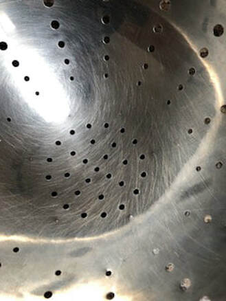
|
I took this photo of a strainer in front of a window as I thought the light reflected in it gave off a cool effect. I enhanced this effect in Light room, after I white balanced the photo, when I further made the highlights more intense.
The strainer, the main subject, takes up the entire photo, the circles exemplified as this photo was taken very close to the subject. There is also a group of circles in the middle of the photo, surrounded by lines of circles, lending the viewers eyes towards the middle of the photograph. I also liked this photo as there is added texture to it, as the scratches on the strainer. Also when you look at the photo you can see the curve which I think adds a cool element to this photo. |
|
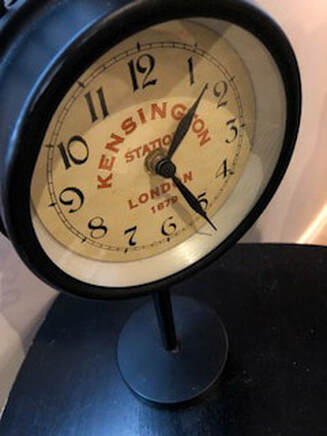
This photo is of a clock placed on a table.
This photograph is weighted towards the top left. The table in this photo allow there to be diagonal lines that lead the viewer's eye towards the main subject, the clock. There is also a vertical line because of the stand of the clock; this gives the photo height. The clock fills most of the frame, leaving little space for negative space. The negative space in this photo also does not distract from the main subject, also aiding in the viewer looking directly at the clock first. After white balancing the entire photo, I simply darkened the contrast and slightly increased the saturation to get this final result. |
|
|
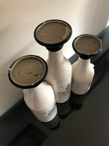
I took this photo of three candle stands, each a different size. The tops of these candle stands are circles. To emphasize the shape of the circular tops of these candle stands I took the photo from a higher angle, looking down at them.
The background of this photo is also split in two, one being the beige wall, and the other being slightly reflective glass. I think the glass add a nice element to the photo as it adds almost another view into the same photograph. The viewer is able to look directly at the main subject, the candle holders, and as their eyes travel downwards they can see the reflection of them. In Light room, after white balancing the whole photo, I mainly just brightened the whites and enhanced the highlights to make sure the candle stands really popped. |
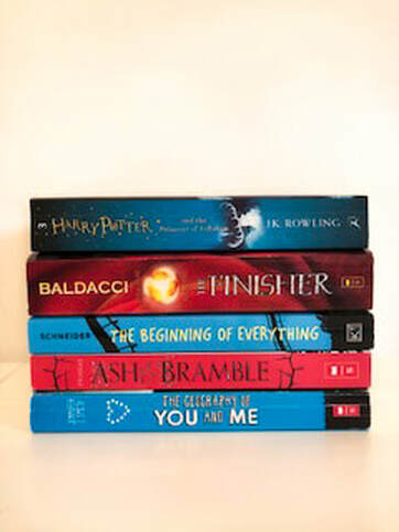
PatternsI took this photo of the spines of book which I organized to have the alternating colours of red and blue. Although red and blue aren't exactly complementary colours I felt in this instance they worked well with one another. The background in this photo is also just plain white, as not to distract from the main subject, the books. The books are placed in the middle of the photograph as they are the main subject, and the viewers eyes are taken directly to look at them. I also organized the books so that the darker shades of blue and red were at the top, giving the effect of the books darkening the further up you look. This photo is also center weighted, making the books appear more static, although I felt that the different colour and designs withing the book's spines added the missing dynamic that the photo may of had if I had taken it at another angle.
In Light room, after white balancing the whole photo, I made few other edits. I took down the shadows and also slightly increased the saturation on just the books. I also tried to emphasize the white in the photo more. |
|
|
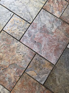
I took this photo of tiles to showcase the pattern throughout them. I also took the photo with the tiles shown on a diagonal to give more dimension, rather than having all the lines vertical and horizontal. This photo is just one section of the tiling, and the best section that I thought complemented each other well. When I first brought this photo into Lightroom I adjusted the white balance by picking a light grey colour in the photo. After that I didn't edit the photo too much, other than changing the contrast and heightening it, as well as slightly highlighting around the edges of some of the tiles to give some more definition.
|
|
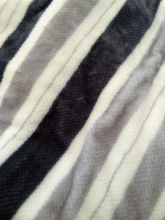
This photo is of line design on a blanket. I like the line design on this blanket as the lines change in size and colour. For the photo I slightly wrinkled the blanket to give more texture and visual interest to the viewer. This photo was also taken on an angle so the lines were not horizontal. When I imported this image into Lightroom I first white balanced it, by choosing a light grey in the background. I didn't do much editing to this photo either, I just upped the exposure and brightness as the photo was darker when I first took it.
|
|
Glasses and Bottles
|
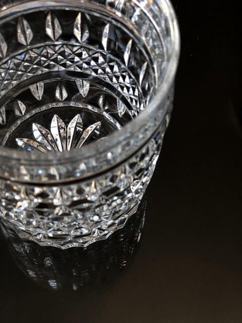
This is one of my favourite photos that I have taken for the shooting assignments. I thought that this glass would be cool to photograph, especially in bright sunlight. I really liked how the light showed up and reflected off the glass. I balanced this composition upwards into the top left corner of the photo, with a slight reflection under it, caused by the glass that I took it on. The black table, covered with glass, also gave the photo the effect of fading, from deeper black toward the bottom, to a lighter shade of black. The glass itself, I took the photo, keeping the focus on the middle and back of the glass, fading the front of the glass slightly. When I imported the photo into Lightroom I first white balanced the whole image, keeping the tone more blue. I also darkened the blacks in the photo and slightly turned up the exposure in order to give more definition to the glass and all the intricate details within it. Lastly, I used the patch tool and removed some dust that happened to be in the front of the glass and took away from the photo.
|
|
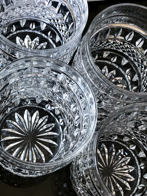
This photo is taken of four intricately designed glasses all placed together. Similar to the first photo I liked how the light showed up on these glasses. I kept minimal negative shape in this photo, filling almost everywhere besides the top right and bottom left. I also liked the contrast between the greys and whites in the glasses and the black in the background. When I brought this photo into Lightroom and began editing it I started with white balancing it and then moved on to also in creasing the brightness. Unlike the first photo I edited this photo a lot more. I added in more highlighting aspects on the glasses to further emphasis the details within these glasses.
|
|
Shoes |
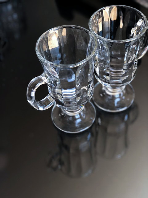
This photo is taken of two glasses, each placed opposite of each other. The photo is taken with the glasses towards the top right, leaving space in the bottom to show the reflection. I also took this photo on top of the black table with glass, which also added a slightly faded out look as well. With the glass there also happened to be a reflective element on the the bottom of the photo. The focus was kept on the two glasses, mainly the top of them. In Lightroom, I first white balanced the whole photo. After that I faded the background of the photo out to better showcase the glasses. Some highlighting was also added to the glasses to increase the look of the light being reflected off of them.
|
|
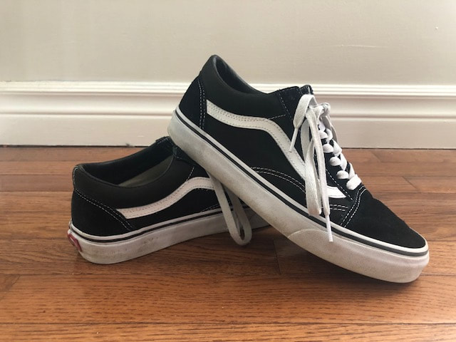
I took this photo of my black "Vans" shoes on hardwood floors, with white molding, and beige walls. This photo is also center weighted. As well the photo contains many horizontal lines, many which point in the direction of the pair of shoes. The focus is on the shoes, which I positioned with the right shoe on top of the left shoe. I really liked that the shoes were black and white, which gave the photo some contrast. After white balancing this image I mainly just highlighted the whites in the photo, not wanting to completey whiten the bottom of the shoes and make it look fake.
|
|
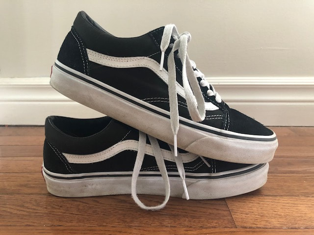
This is another photo that I took of my "Vans" black and white shoes. I took this photo with also having the same background, but I did change the position of the pair of shoes. In this photo I stacked the right shoe on top of the left shoe. This photo is also center weighted. Along with editing, after I white balanced the whole image and highlighted the white parts of the shoe slightly I did not do much else. I did very similar editing as the previous image.
|
|
