2020
Tropical Poster
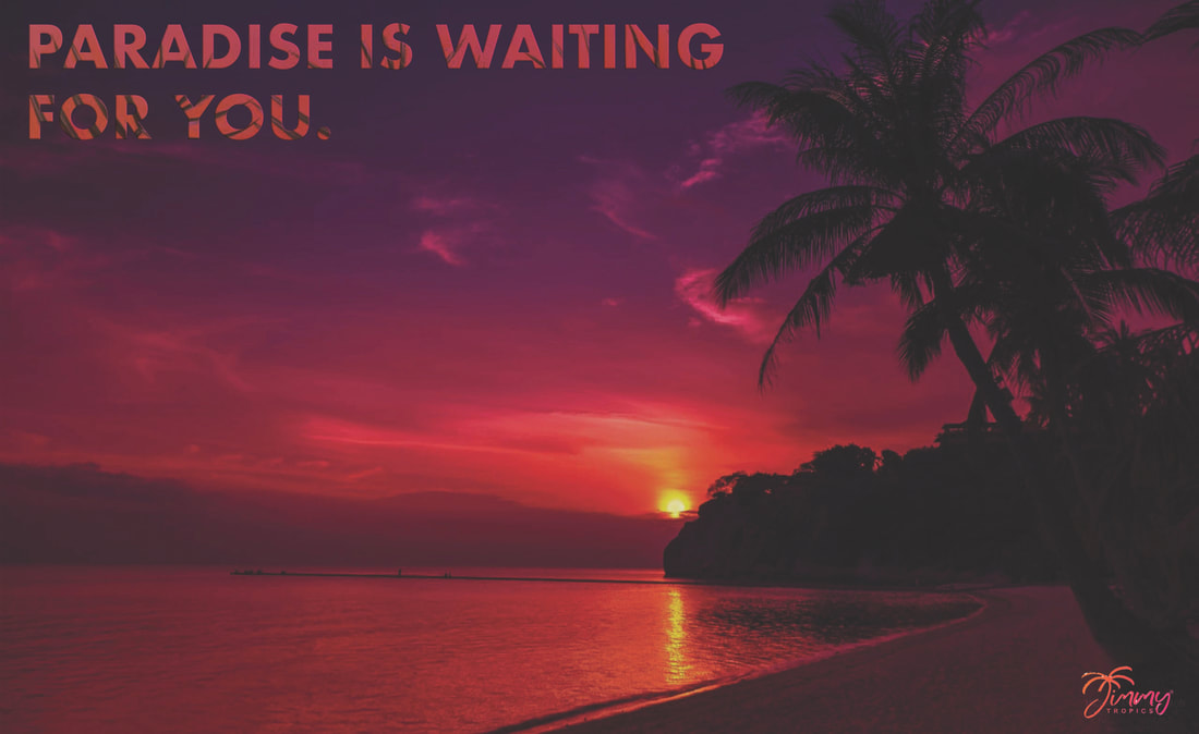
To begin the tropical poster I first found a photo that I wanted to include as the main photo in the background. Once I chose this photo I brought it into photoshop by embedding the image. After that I adjusted the hue/saturation of the image to include lighter tones overall. Once I was done with that I added the text “PARADISE IS WAITING FOR YOU” and moved it to the top right corner. I then added a drop shadow and bevel and embossed the text. After that I brought in a simple photo that had some palm leaves on it and placed that directly over the text I had just written out before creating a clipping mask. After creating the clipping mask I edited the hue/saturation of the image until it was similar to the light pink in the image. After I was happy with that I moved on to finding a logo online. I then took this logo into photoshop and by using the quick selection tool and magic wand tool I was able to make this image into a png. One I was happy with how my png logo looked. I brought it onto my tropical poster and placed it in the bottom corner. I wanted the logo and the text to occupy separate corners of the poster so that the onlooker's eye could focus on the tropical background before reading the text and logo. Finally, I went ahead and saved the poster, flattened the poster, and then exported it as a .jpg file. Overall I am happy with how my tropical poster turned out. I think that the colour palette I chose to go with really gives off a serene and tropical feeling. The background, text, and logo also all really match each other and support the complete composition to feel like one coherent piece. This assignment was also a really nice refresher of many of the basics in photoshop.
Multiplicity Assignment Practice
|
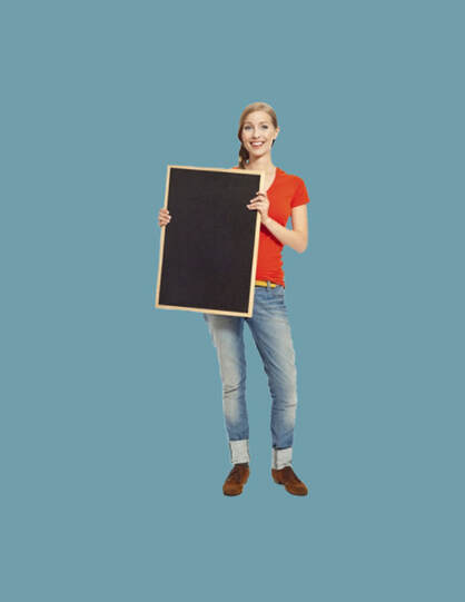
To begin preparing for the multiplicity assignment we practiced with stock images. After embedding the stock image of a person into photoshop, we changed the background and foreground colours and then created a clipping mask on that layer. Once we have the clipping mask applied we can use the foreground and background colours to reveal and conceal. In this sense we can then conceal the area around the person by tracing the area around them with a brush. I used a harsher, round brush to roughly trace around the edges of the stock image before going in with a softer brush to trace closer around the person in order for there to not be a harsh line around the person, which would give an unrealistic look.
|
|
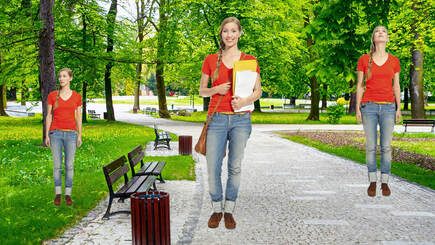
For further practice for the multiplicity assignment we practiced placing multiple people in the same composition. For this, we first imported a park background. I then embedded each image one by one and applied the same procedure that I had already done previously. After I was happy with how the clipping mask looked I resized two of the stock images, ensuring to hold down “shift” so that I did not skew the size, and altered where they were in the composition.
|
|
Final Multiplicity Composition
Editing:
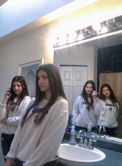
To complete my final multiplicity assignment I began by taking the photos I needed. I set my phone up and ensured to keep it in the same place for the duration of taking photos. After I had taken many photos I reviewed them and decided which ones would best work for multiplicity.
I then imported all my images into Lightroom. In Lightroom, I fixed the white balance, saturation, contrast, exposure, shadows, highlights, and etc. On the dark areas under my eyes I also used the clone tool to lessen just how dark it was. I then applied these changes, (except the clone tool), to all of the photos I uploaded by using “command + click” and selecting the other images before going to the settings tab and selecting “sync settings.”
I used the tools that I had learned previously and after importing each of my images into photoshop, I created clipping masks. With the clipping masks, and using “x” to switch between reveal and conceal, I used the brush tool to create the illusion of multiple versions of myself in the same shot. I again switched between a harsher and softer brush to ensure a more realistic look. This process definitely took a while in order to make sure that the composition appeared the way I wanted it to. The most challenging part of this assignment was the overlapping of the versions of myself, but overall I really like the end result of doing this. Another challenging aspect of this was also the fact that I used a mirror to capture some of my images. This made it difficult in some cases because there were already two of me in some shots. These challenges only made me practice my skills in photoshop further and was, in the end, a really fun assignment with some cool results.
Overall, I am happy with the final result of this assignment. However, some places where I think I could improve would be to better make use of the effects in photoshop that allow you to add in shadowing. Practice with this skill would definitely make a positive impact on my work.
Message:
Before taking the photographs for this assignment I brainstormed about how I could creatively take photos for this assignment that would prove to create an interesting composition. I knew I wanted to make a kind of storyline to why I took the photos in this way. In the end, I decided upon this idea.
With this composition I aimed to represent overthinking. As someone who struggles with overthinking quite often, as many others do as well, I wanted to create an interpretation of a photograph that shows how it feels. With overthinking comes what feels like a tangled webs of endless thoughts, all crammed together inside your skull. Overthinking can cause a lack of focus with anything unrelated to the thought process going on in your head. Even when you try to distract yourself, the thoughts are always there, sitting in the back of your head, just waiting until all focus is back on them. Overthinking can feel consuming, especially when the content is negative.
In my final composition there are several versions of myself, that not only express different emotions, but also are taking part in different tasks. I wanted the photo to communicate a sort of overwhelming feeling at the fact that there are several subjects placed together in close proximity to each other. It makes it hard for the viewer to focus on just one subject, relating to overthinking and the inability to stop from spiralling and looking at all the possibilities.
2019
Photoshop Girl

After bringing the photo of the girl into Photoshop we edited the background. We also used the lasso tools to outline the girl. After that we picked the foreground and background colours and filled the backgrounds using the colour we choose. The cutout of the girl was placed on top. I then added the text and double clicked the layer to obtain effect options. I applied, emboss, drop shadow, stroke, and inner glow to the lettering. After, I duplicated the layer with the girl in it and edited that layer. We used some of the same effects on this layer as we had for the text and others, including, outer glow and gradient overlay. We then put the original layer of the girl in front of the duplicated layer so it would act as a shadow. We also placed a crown on the girls head from custom shapes. We also added a drop shadow, inner shadow, and emboss as effects to the crown.
My Photoshop Poster
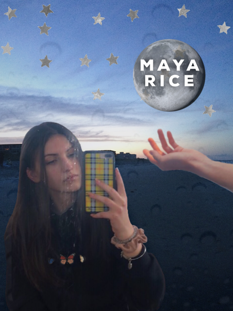
I am quite happy with how my photoshop poster turned out. I first started this poster with the background. I choose the background picture as one that I had taken in Florida on the beach. I used this picture as I loved the way the sky looked in it and also because it showcases a beach, one of my favourite places to be. On top of the background I also placed a moon, featuring my name written within it. I chose to put a moon as I love studying astronomy. The moon also can represent the unknown, and there is a lot of unknowns in life and what's to come. I like the symbolism that the moon can encompass. The hand under the moon also can have the meaning of trying to balance these unknowns. Their are so many unknowns in my life to come that I look forward to. Also in the sky I placed silver stars. This also represents my love for astronomy, but more so my connect to the symbol of stars. For as long as I can remember I have always wanted and small star tattoo because I love the symbol of stars so much. In this poster I am also wearing a hoodie with three different coloured butterflies on the front. I included this feature as it showcases my love for all animals. Lastly, I also added faded raindrops moon top of the whole composition. These were added as also to represent my love for the beaches and oceans. Overall, I think that this poster is a good representation of who I am and what some of my values are.
Creating Symmetry in Photoshop
BEFORE :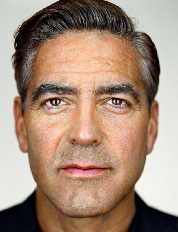
|
AFTER :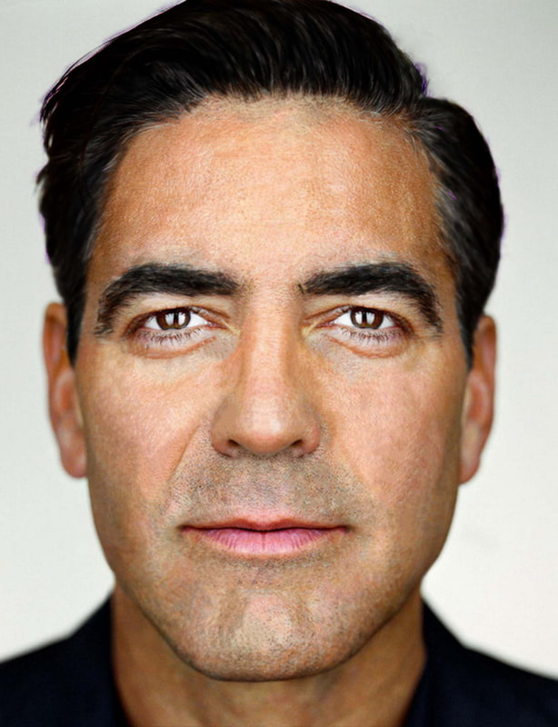
|
To create symmetry in photoshop for someones face we first selected which side of the subject's face (for each the eyes, nose, and lips) we wanted to copy onto the other side. We then copy and inverted the images, making sure to keep the selected area the same size. We also used the opacity tool to make sure we pasted the images in the right spots. Then, to reduce the harsh lines of where we copied and pasted the different sides of the face we used the healing brush that was slightly feathered. This ensured that the new overlayed images meshed well with the new area they were placed in. After we were happy with the symmetry in the face we moved on to the skin edits. We used both the healing and spot healing brush to reduce the wrinkles, skin imperfections, under eye shadows, and pores. We also used the spot healing tool to remove the grey hairs from his eyebrows, and as well darkened his pupils to add more detail to his eyes. After these skin edits we moved onto darkening his hair. For this we used a clipping mask, choosing a darker colour. We then used white to reveal this darkening effect underneath for the hair, and eyebrows. As a result we got less gray and a younger look. This was the result of this photoshop assignment.
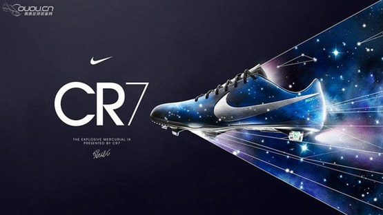
Shoe Ad Inspiration
|
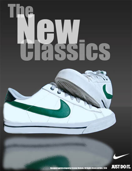
Ad #1This ad contains many elements that I find visually appealing, including the font art. The font in this ad is overlapping in parts and is slightly opaque and not a stark white. Because the font is not a bright white, the white shoes still remain the main subject, and what your eye is drawn to. The entire ad is also made up of grey and whites expect for the green on the shoes, making them stand off further. In this ad the shoes are also reflected at the bottom, adding another layer of interest to this ad. I also like how the shoes are positioned in this ad, you are able to see one full side of the shoe as well as part of the top and bottom of the other. Because the show is positioned this way and seems to sink into the background it also gives this shoe ad depth. This shoe ad to me is just overall interesting to look at with all its layers and seems to be well planned out.
|
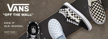
Ad #2This shoe ad interested me as it seems very busy while still keeping the products it's advertising in full view. Since the background is a more muted grey having the products, (the shoes), on a darker skateboard leads your eye more towards them.
I also liked how several different shoes are shown within this ad and none of them really seem to match. You are able to see several different styles of Vans shoes in one single ad, which I think is very smart. I as well enjoy the colours chosen, I think having the shoes being advertised as black, white, and grey make the products stand out that much more. The logo and text on the side being white is also a nice contrast to the background. |
|
My Shoes Ad |
Ad #3This shoes advertisement has a very asymmetrical balance to it. On one side you have the product being advertised with bright and busy designs shadowing it, and on the other side you have the name of the product and brand.
I like how this ad is simple yet tells you exactly what you need to know about the product while still being visually appealing to onlookers. The designs chosen to be put behind the shoe also emphasis the shoe more so which is something I think is very clever, it's like showing you here is a small piece of this large artwork that you can buy. I think the whole planning and execution of this shoe ad is very well done. |
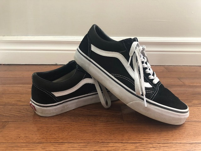
BEFORE :
AFTER :
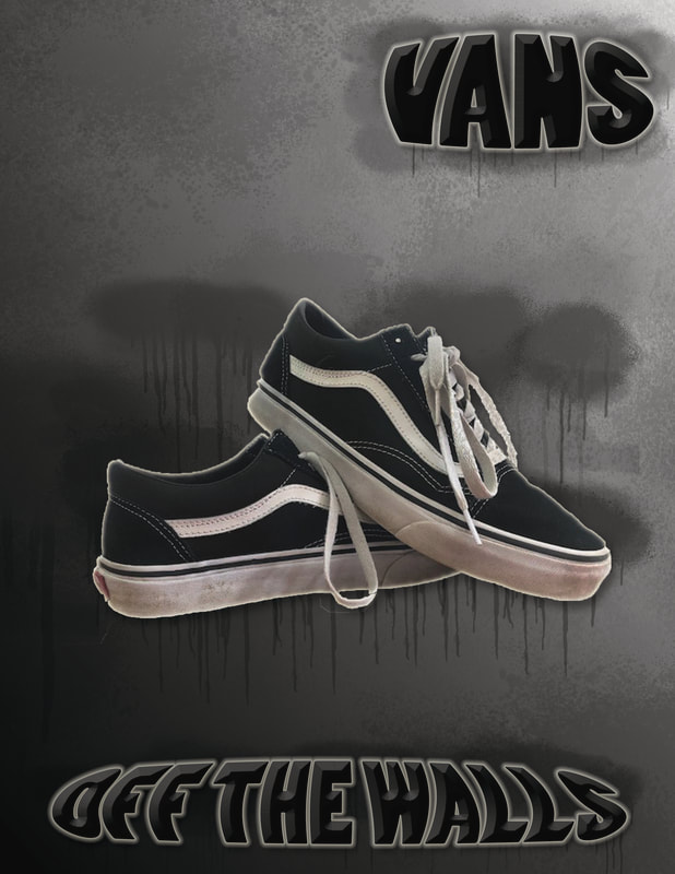
This is my finished shoe advertisement. When I first started with creating this poster I took a picture of the "Vans" shoes I own and then imported that into Lightroom for editing. In Lightroom I mainly highlighted the whites more and darkened the blacks in the photo. After I was happy with my editing in Lightroom I then brought the image over to Photoshop. In Photoshop I was able to use the quick selection tool and removed the entire background, only leaving the shoes. I then created a new blank project and pasted the shoes in the center. For the background I decided to go with a gradient that was lighter in the top right and became darker as it went to the bottom left. I then added text onto the advertisement. In the top corner I added the brands name, Vans, and on the bottom, in the middle, I added the slogan, "Off The Walls." For both of these texts I used the emboss and bevel tool as well as the outer glow tool in order to make the words stand out on the eye and catch your eye. As well in the background of all the words I added I also used a graffiti brush that I downloaded from brusheezy and used it behind the text to make it stand out even more. I then moved onto the actual product of the advertisement, the shoes. I applied the outer glow tool to them, as I had also done with the text in order to give the shoes more dimension and help them separate from the black background. I then went on to add more graffiti behind the shoes, keeping the colour of the graffiti darker then the background colour, I made sure that you could see the graffiti dripping out from behind the shoes to add to the effect and be more visually appealing, I also did this with the text. After this I added more accents of the graffiti in lighter shades all around the add, mainly to the top left and bottom right, darkening it the closer it got to the border of the ad. I think that ad does a good job of showcasing the shoes as well as including many visually enjoyable aspects. If I were to change anything about the advertisement I would make sure that the white throughout is more highlighted and incorporated into the ad. I wouldn't change the graffiti as I am very happy with how it turned out. Overall, I am very happy with how my shoe advertisement turned out.
