2019
Pac-Man

|
The yellow pac man started off as an octagon. By using the anchor point tool I was able to curve the corners and create more of a pac man shape; also adding in a mouth. The ghosts where created by tracing the outline of imported images of the ghosts by using the pen tool. I also used the anchor point tool to curve part of the ghosts. I duplicated the ghosts so that there were four of them and changed the colours to match those of the actual pac man ghosts.
|
Yoshi
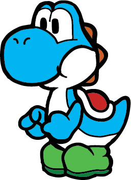
Firstly, for this Yoshi drawing I imported an already complete Yoshi into Illustrator. After imposting the image I locked that layer and then created a new layer were I used the blob brush tool in black and traced along the image. I also dimmed the image underneath so that tracing the image would be easier. After that I created another layer under the black tracing of the Yoshi. On this layer I added colour, differing from the original colours of Yoshi, changing them to green and blue, with orange and red accents. After completing the drawing we exported it as a png.
|
Self Portrait
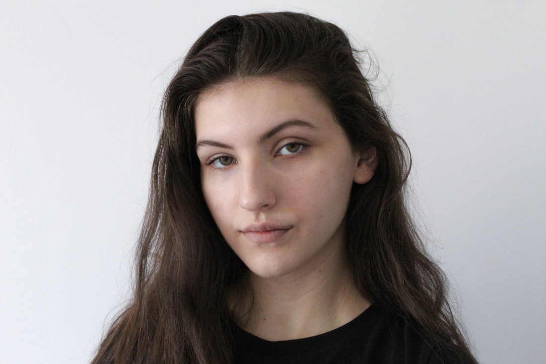
This was the photo that I choose to use for my vector drawing. I choose this photo as it was taken in good lighting and therefore has good colouring and minimal large shadowing. I wanted to choose a more simple image to aid in making the vector drawing.
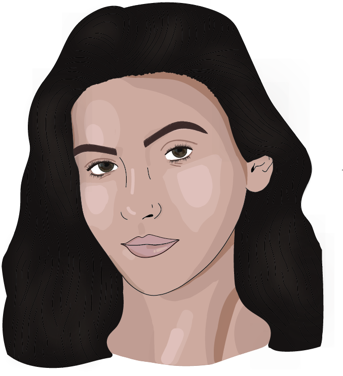
This is my self portrait. I am quite happy with how it turned out, although there are things I would want to improve if I were to do another drawing similar to this.
The first thing I did after opening Illustrator and importing this photo of me, sizing it, and locking that layer I moved on to the eyes, specifically and pupils and the whites of the eyes. After that, on another layer I worked on the lashes, creating several single lashes, then grouping them. I copied and pasted the lashes to other areas to fill in the top and bottom lash lines of both eyes. These items probably ended up taking up most of the time as I wanted to make the eyes look as real as possible, as they were a main focal point of the piece. I also drew in the creases under and over the eye, turning down the transparency, giving more dimension to the drawing.
After the eyes I moved on to tracing the face, leaving the stroke of the pen tool black and filling it with and medium skin tone for myself. When I was tracing the face I noticed that the pen tool was somewhat difficult to work with, having to try several times to make a correctly curved line.
After having the main base for my skin edit I moved onto completing the lips. On yet another layer I traced my lips in black and filled them with and medium toned pink that was most prominent in my lips. I then, after swatching the other darker and lighter prominent colours I layered the original medium tone colour with lighter and darker tones of pink to contour and highlight, while still adding dimension.
I decided to do my eyebrows next, and created another two layers. On one layer I outlined my eyebrows in a slightly transparent brown that I took from my actual eyebrows in the original photo. Next on the layer on top I used a slightly oval brush, lessening the opacity, I created slight hairs in the direct of what the photo shows. After that on the same layer I used the same oval brush, removing any of the opacity and then again drawing more small hairlike lines onto the eyebrow. After I finished with the process I cleaned up around the eyebrows with the eraser tool.
Since I had the eyes, eyebrows, and lips done I decided it was time that I do the nose. On a new layer I simply took the brush tool, and using the colour black, freehand drew certain areas around my nose to create a brief outline and depth.
I went for more of a less blended look for the skin edit, leaving large areas of layered highlight. I also used minimal colours for the contour and highlight of the face. I feel like the look of the vector drawing without too many crowding colours looks more appealing. Originally I did add in more colours to the skin edit but than decided to go for a different look, and created this look. I started by contouring with the darkest colour around the sides of the face. I then moved on to the cheeks of my face, layering the lighter colours on top of the darker ones. After finishing the basic look of highlight and contour I added in highlight under the eyebrow, forehead, more to the cheeks, under the lips, and on the nose, to show were light was majorly reflecting from. I then contoured slightly the sides of the nose, under the eyebrows and beneath the nose.
From the skin edit I also traced the outside and inside of the ear, adding a medium colour to the drawing.
I also traced my neck and filled it again with the same medium tone I used for my face. I also contoured and highlighted my neck, again using the photo of myself of reference. For the neck I did not make the outline stroke black, as I knew I was not going to complete my shirt but end in a sort of semicircle were my shoulders would be.
Finally on a layer above all the other ones of started drawing long curved black lines following the shape of my hair. After I was complete with that, I traced all of my hair, leaving an outline for me to colour in. On and layer underneath the black traced lines I added in a dark brown everywhere, adding hand drawn hair strokes along the hair line as to not make the vector drawing too cartoonish. On top of the dark brown I also added a lighter brown that I made extremely blurred in order to create the effects of highlights and light shifting in my hair.
